Friday, May 10, 2013

Beach style with pizzazz!

I am absolutely in love with HGTVs Smart Home, located in the Jacksonville Beach community of Paradise Key South Beach.

The color palette used in the house in sensational. The design focuses on High Regency and is flavored with sea-inspired colors!

Something that is extremely important when choosing paint colors for your home is making sure that all of the rooms flow together. Otherwise your house can feel choppy and the color may seem like an after thought instead of cohesive.

So let's see these photos! These are a great way to see a great color palette that works well in every part of the home.

 
Out of the entire home, this is probably one of my favorite places. The blue and white geometric patterned wall reminds me of a college project a friend and I did to dress up our campus apartment. It is extremely easy to execute and adds character to any room.


One thing that I want to note, is that the majority of home owners paint their ceilings white! Here is a great example of how to paint your ceilings the same color as the walls and it still looks bright and airy. Of course, I would recommend this paint option if the colors were dark, but it sure does look fabulous in this beautiful dining room.


The kitchen features white cabinets paired with a stunning soft blue wall and rich, warm wood floors. The space is warm and inviting with the neutral color palette and is set off by a pop of orange!
 
Another important design factor in creating cohesion is the use of textured items. The wicker chairs are a superb feature adding a much needed texture to the space.


How will you incorporate color into your home? Share your thoughts with us...we would love to hear them!


Friday, March 15, 2013

Green with Envy


St. Patrick’s Day is just around the corner and Cherry City Interiors & Design would like to know how you will be celebrating this festively green holiday.

When it comes to decorating your interior during the holiday, sometimes a nod to theme is best than a literal adornment of decorations.

St. Patrick’s Day can be a tricky holiday to achieve this. Here are several ways you can have your shamrock shake and eat it too!

No longer do you need to search in the yard for your lucky four leaf clover, because there is a great architectural element called the quatrefoil. The word quatrefoil means “four leaves” in Latin, which can easily be associated with the lucky four leaf clover.

The quatrefoil mirrored credenza and quatrefoil lumbar pillow add a repetitive pattern in this traditional meets mid-century space.

Every aspect of this space has some sort of structured shape to it, so it was cleverly designed to utilize the quatrefoil in the coffee table to continue featuring geometric shapes throughout the space.
Below are some great pieces of furniture that could be used to decorate your home during this holiday.


There is also the option of designing your home for St. Patrick's Day in the literal sense. Adding anything green to your home can correlate to the holiday themed colors, but also just because if you are like me, you love GREEN!


 I LOVE this green, black & white color scheme. This is a little on the extreme side and a commitment, but definitely tolerable. The green is used as the accent and as you can see, the show stopper.

The geometric upholstery on the chair adds a little pizzaz to the kitchen. A great way to incorporate these bold colors is in items that can easily be changed out. This is especially important to remember because like most of us, our taste changes over time.


The above photographs are some easy to change literal interpretations of the holiday. These items can be put away as the festivities pass, making it easier to celebrate the holiday in style.  

How will you celebrate St. Patrick's day this year?!?

Tuesday, March 12, 2013

Pastels


Pastels are BACK! No nursery here…

The word “pastel” typically can be bundled up into a series of stereotypes: Easter eggs, little girl’s bedrooms, and how could we forget the 1980’s? Although these are the first images that come to mind, pastels today have re-emerged into the design world as a bright, airy and calming option in retail, health-care and residential settings. Pastels don’t have to be “baby blue” or “baby pink”. They can have just as much depth and presence to them as a more vibrant and typical color.

This room could be both feminie and masculine; it's all in how your perceive color.

Guys like pastels? What? NO WAY!
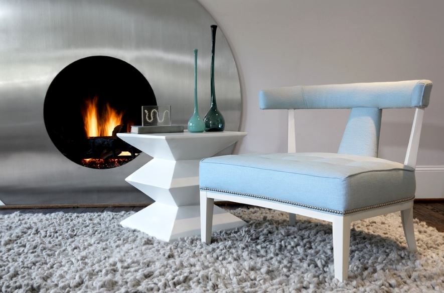

One misconception about pastels is that they are solely “feminine” colors. Men aren’t too keen on the idea of using pastels in their man caves because they have a girly connotation. However, pastels can be defined as pale grays and blue-grays, which are very masculine hues. So no worries, guys, you can paint your walls with pastels too!


Pastel blue is paired with stainless steel, gray and sharp white to give a very masculine feel.

Pairing up the pastels

Sherwin-Williams focus on pastels in a few trend palettes. “Vintage Moxie” interprets the retro colors of the 1950s and ‘60s. They not only exude a carefree attitude that is being seen in current fashion trend but with the economy being the way it currently is, people want to get the feeling of fun back into their lives and décor.

Pale green green sofa with pale yellow walls compliment one another while using an orange to add depth & dimension.

How can you use these in your home décor without looking like a dollhouse? Hues like SW0074 Radiant Lilac, SW6771 Bathe Blue and SW0025 Rosedust are coupled with black and white to give a more modern edge. Pastels typically need a strong color to accompany it to give that “adult” ambiance. With pastels being slathered on retail stores, having a contrasting bold color is key to making it work. Combinations of bright red serve as an assertive accent against lavender walls.

This vingette demonstrates the use of several pastel colors. Both the purle and blue shown are pastels and when paired together they make quite a statement. Soothing blue walls calm the ambiance of the space, creating a welcoming feel.

Where can you see this fresh array of pastels? Think of places where you would see this, other than in a nursery? Soothing, gender neutral pastel hues can help you calm down and feel relaxed, so places such as spas, health-care facilities and the hospitality industry are just a few spots that would benefit.


I love the pastel freen used on the sofa. With a view like that, you want your furniture to slightly fade away in the background! Notice the bright blue in the adjacent room.
Bringing pastels into the home...

Painting your home can be a tricky business. Be aware of some pastel colors such as a soft yellow. When pairing it with other complimentary colors such as blue it can take on a green cast, completely altering the color. Yellow doesn’t always provide the best coverage and tends to reflect colors surrounding it.


This gray blue is sublte amongst the subtle tones in this living space. I love the pop of red in the floral!

Pastels can be best used in smaller spaces like a bedroom or a bathroom. When deciding on the right color, select the color of choice and then pick a shade lighter. Once color is spread on the surface, it becomes a little more intense. Maybe you decide to put a pale blue on the wall. A great option when pairing a contrasting color is maybe installing a complimentary tile on the floor, like a yellow and white patterned tile.

Pastels can easily be incorporated into your home. Try it out and see what you think!

Tuesday, February 12, 2013

Mardi Gras....In your home??

Mardi Gras, French for “Fat Tuesday”, is a carnival held around the world to signify the season of Lent. Each city celebrates this festival differently, including our very own New Orleans, USA.


Mardi Gras color pallette
Held in the city’s French Quarter, this New Orleans festival features special music, parades, picnics and floats, all of which create a dynamic sense of excitement the days leading up to, and on Fat Tuesday.

 
So when you think of the typical New Orleans inspired Mardi Gras, you must think of beads, extravagant masks and the colors, purple, green and gold, right? And if you like these design elements and colorful hues that this celebration has come to embody, then why not make Mardi Gras a part of you everyday design and decor?


Let’s explore some creative and fun ways to celebrate Mardi Gras in your home year round!


Vertical gray and purple wallpaper pair perfectly with the mix matched pillows and flower patterned rug for a comfortable yet feminine room


Captivating shades of purple promote a luxurious look and feel in this living area. Lustrous gold accents add a powerful contrast to the richness of the purple, while the mix of fabrics, such as the satin and velvet, add a further interest to the space. I love the subtle hints of green surrounded by a neutral palette, which allows the rich purples and golds really pop!


Very streamlined, this space aptly demonstrates how beautiful these colors work together as a good team. Using the right tones and hues of purple, green and gold in one space is key!

As I’ve shown you through the above examples, it’s easy to incorporate Mardi Gras inspired interior decor into your own space. Just remember, inspiration can come from anywhere, even from a piece of confetti strewn across the streets of New Orleans!