Monday, December 31, 2012

Color Predictions for 2013: Color Psychology in Interior Design

It is here! The new list of awesome colors from Pantone. But first, you may be wondering who or what is Pantone? Let me explain.

Pantone LLC, a wholly owned subsidiary of X-Rite INC., is the world-renowned authority on color and provider of color systems and leading technology for the selection and accurate communication of color across a variety of industries.
The PANTONE® name is known worldwide as the standard language for color communication from designer to manufacturer to retailer to customer. (www.pantone.com)

With that said, let’s see what colors have been predicted for 2013. I think this year will show a wide variety of fun colors. Ok. Here they are!

Food for Thought

Before we delve into the meanings of colors, remember, color has a powerful influence on our daily lives. We see color differently and interpret their meanings and how they make us feel differently as well.
By understanding the psychology of color, which identifies the psychological effects individual colors have on our minds and bodies, we can design rooms that foster health, well-being and prosperity.

1. Monaco Blue

Tips: Blues work well with other pastel and "cool" shades (like greens), and are an excellent complement to earth tones and neutral colors like gray and beige. But be careful when using orange with blue, because these two colors vibrate against each other and cause a jarring effect.

Blue is the color of the sky and sea. It is often associated with depth and stability. It symbolizes trust, loyalty, wisdom, confidence, intelligence, faith, truth, and heaven.

Color Psychology: In interior decorating, you can use the color blue to create a reflective, 'intellectual'atmosphere: it's not easy to overheat emotionally and get upset or aggressive in a 'cool' environment - and the color blue has actually been shown to lower our blood pressure and heart rate.

Question: What does Monaco blue say to you and your style?
2. Dusk Blue

Tips: To add a calming influence in any area of your home, even in places in your home with the most activity, the presence of blue is at its most effective. Balanced against white, blue is conservative, and productive. It communicates trustworthiness, which is why shades of blue are used so often in company logos. Against yellows and orange spectrums, it keeps things fun, yet with a hint of efficiency too.

Blue is like the strong, silent type. It’s cool, it’s collected, and it commands respect. After a day of activity at a frenetic pace, blue is the color of sanctuary, which is a big part of what a home should be for you.

Color Psychology: Where it’s true that blue is known as something of a psychologically moody and melancholy color, the flipside of that is that it’s also associated with tranquility and quiet. As a sort of polar opposite to red on this front, blue slows the pulse rate. In a space where you’re looking to slow things down a bit and promote calming clarity, blue can be an easy way to attain that.

Also, blue communicates a certain level of professionalism and trustworthiness (think“blue ribbon” or “true blue”), making it something of a go-to color for offices, both residential and commercial. This may have an effect on how productivity tends to be higher in blue rooms. Of course, blue is also cool, in that Miles Davis sort of way, too.

Question: What does dusk blue say to you and your style?

3. Emerald
Tips: How can you think green and not think nature? Green means growth. Centered in the color spectrum, green stimulates feelings of harmony and peace. It is a great color to create balance. A very highly adaptable color, green is restful and that makes its lighter shades and tints a good neutral or background color. Its darker shades also absorb glare.
Color Psychology: You could also try mixing a tiny bit of the complementary color, red, into your green paint. That mutes it slightly and adds complexity and depth.
Alternatively, you could tint it with white or light grey, or discolor it with some yellow or blue - these are all ways to utilize the psychological effects of the color green while avoiding the decorating pitfalls.
Question: What does emerald say to you and your style?

4. Grayed Jade
Tips: Green is a dominant color in the natural world and is therefore often associated with all things lush and wild. It is the color of “yes”, and the color of “go”. It is a color we most associate with positivity, and invitation. It denotes growth, and wealth. And because it is so well connected with the natural world, the color green communicates a unique sensitivity and organic soulfulness.
Color Psychology: Green offers the calmness of blue, and the energy of yellow, managing to achieve a balance between them. Green is lush, natural, and welcoming, and connects us subtly with our environment. In the 21st century, green has come to mean many things, but one is more significant and it is now the symbol for sustainable living. The color green in a space can outward express the modern lifestyle, even as it provides a stylish atmosphere in any space of your home.
Question: What does grayed jade say to you and your style?

5. Linen
Tips: Beige or cream is a neutral color which suggests practicality and conservatism, and alone, it can be tiresome and plain. But as a background color with graphics which are earthy, like browns and greens, or blue and pink palettes. Beige is a good color to use in the background, as it will allow for maximum readability of content.
Beige/cream can take on some of the attributes of yellow or pink when touched with those shades.
Color Psychology: In color psychology, brown is honest, genuine and sincere. It relates to the hardworking, the industrious and reliable, with both feet planted firmly on the ground. Related to the family of browns, beige, tans, ivory all have important meanings to themselves.
Light brown is a friendly, approachable color and is sincere, honest and genuine. It adds comfort and warmth to any space. Tan colors are ageless and timeless, straightforward, uncomplicated and natural. Ivory boasts of calmness, yet is encouraging, with a reserved style of simple sophistication.
Question: What does linen say to you and your style?

6. Poppy Red
Tips: Red is the hottest color of the spectrum and can make anywhere seem warm and cozy, so is ideal for people who suffer from the cold. Red is not a good choice where calmness and clear thinking are required, it’s energetic frequency is not conductive to areas where rest is needed, so it’s not a good choice for bedrooms or relaxation areas.
As with other colors, the psychological effects of the color red depend very much on its intensity. So while vibrant, saturated hues of red have been shown to raise people's heart rate and blood pressure, you might feel quite comfortable with muted, warm, earthy shades of red around you.
Color Psychology: Red is associated with passion, heat and energy. This color is very bold in its pure form. It can be very elegant and add a lot of character to a color scheme – both traditional and contemporary. It’s a great accent to the green family which lies opposite red on the color wheel. Even in its softer tint of pink, red can add much character to a design scheme.
Question: What does poppy red say to you and your style?
7. African Violet
Tips: This color is quite popular for painting a girls room. Recently it has been used for a more modern feel. The images below show hints of purple, pared with other more neutral tones, especially wood. The dining room exhibits plush purple colored dining chairs
Color Psychology: Purple does not often occur in nature. It can sometimes appear exotic or artificial and is a symbol of royalty and wealth and can also represent wisdom.
Question: What does African violet say to you and your style?

8. Lemon Zest
Tips: Yellow adds warmth and cheer to any room of the house. Yellow can add a feeling of brightness to rooms that perhaps need a bit of a boost where light is concerned. It is a vital color that stimulates the senses, having a positive effect on appetite. It is the color to use when you’re looking to display an assertive personality in a space, or one that needs a bit of pure, childhood wonder.
When tempered with complementary shades, yellow can add important balance to the atmosphere of your home, cheering up moody blue, making artistic purple more accessible, and generally letting the sun shine in.
Color Psychology: In addition to the bright, cheery quality that yellow can bring, it is similar to red in that it is an extroverted color. It calls attention to itself. It activates memory, and stimulates the mind in general. It inspires action. To bring out a sunny assertive mood in a space, yellow is ready to go.
Yet, another aspect of yellow that makes it less a candidate for bringing vitality to a space than, say, a red or orange, is that yellow is the most distracting of colors that is processed by the human eye. As such, too much yellow can be a source of pain, as much as it can be a source of cheer in another context. So, when thinking of incorporating yellow into a space, it’s time to do a little bit of thinking. When it comes to the spectrum of cheery to naked hostility, you want to get it right.

Question: What does lemon zest say to you and your style?

9. Tender Shoots
Tips: One way to use the color green in interior design is to combine different huesof it, or combine the color green with other colors. However, using the color green in interior design is a bit of a challenge - green is one color that can really go wrong on walls and fabrics.
Color Psychology: Green is associated with nature, relaxation and rest. Green is very versatile in working with other colors as it is in nature. It can be strongly traditional in feel or even a bit contemporary, as in the case of its more acidic forms. When designing, consider using a splash of red from the opposite side of the color wheel to create a dramatic accent for a green based color scheme.
Question: What does tender shoots say to you and your style?

10. Nectarine
Tips: The color orange is generally experienced as the warmest color. Orange is a sensuous color. It is perceived as emotionally stimulating, energetic, vibrant and fun. So if you don't want a strong color impact in your home, shades or tints of the color orange will work much better for you.
Color Psychology: Orange is associated with vitality, activity and adventure in color psychology. It is believed to have healing qualities and is supportive of the immune system. When used in its more muted shade it can be less overwhelming. Terracotta flooring, apricot fabrics or other muted varieties of this hue can be quite pleasing to the eye. Pure orange may work well in a contemporary setting but often doesn't sit well in a traditional one where a more muted form works better.
Question: What does nectarine say to you and your style?




Tuesday, November 27, 2012

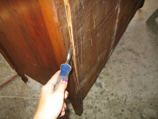
How to Turn a Cabinet Into a Bathroom Vanity


Finished cabinet! Looks fantastic.
Do you have an old cabinet that you wish you could find a home for? Possible furniture passed down from your grandparents you think is "out of date"? You probably have seen the solution, maybe in a magazine photo or browsing through houzz.com (that awesome site I introduced to you!) but didn't know how it was created or that it was even repurposed.

 I have to admit, I am IN LOVE with this idea! It is a great way to keep these beautiful pieces of antique furniture in your home...just more fashionably updated! So I began the search online and found this great tutorial and step-by-step instructions on how to transform any cabinet into a bathroom vanity. When I have a home of my own, I will do this (and looking forward to it)!! For one, it's giving a gorgeous piece of furniture new life and secondly it is completely unique to YOU!
 
OK, let's get to it.

Materials Needed:

1. screwdriver/electric screwdriver
2. saw
3. nails
4. C- clamps
5. 2x4 boards
6. plywood
7. hammer
8. staple gun
9. drill bit
10. measuring tape
11. scale saw
12. jig saw
13. pencil
14. caulk
15. caulk gun
16. painter's tape
17. painter's spatula
18. liquid nails (stone adhesive)
19. rag
20. acetone
 
Step One: Remove Top
Unscrew the top of the cabinet and remove it from the frame.


Step Two: Reinforce Frame (if needed)
Using an electric screwdriver, reinforce the cabinet by putting a long screw in the center of the frame.


Step Three: Cut Subtop
Measure the top of cabinet and cut a subtop out of plywood to replace the original top.
 
Step Four: Remove Back of Cabinet
Using a hammer and a screwdriver, remove the back from the cabinet.


Step Five: Reinforce the New Frame
Cute a piece of 2"x4" board to the height of the inside of the cabinet and place the board parallel to the original support beam. Glue and screw the new support beam in the center front of the cabinet to allow room for the drawers and sink.
 
Step Six: Remove Original Support Beams
Using the saw, remove the original vertical support beams in the center back of the cabinet. Remove the support beam that runs parallel to the bottom of the cabinet by sawing off about 6".


Step Seven: Attach Subtop
Screw the new subtop to the top of the cabinet using a C-clamp to hold it in place. Glue and staple 4" x 2" x 2" pieces of wood underneath the subtop at each corner.


*TIP: You can also attach a granite slab or material of choice. Make sure that the granite slab will be supported properly and have the sink hole already cut out.
 
 
Step Eight: Cut & Modify Drawers
Mark on the drawers where you will cut to leave space for the sink and pipes. Using a saw, cut out the shape. Build a frame that surrounds the cutout on the drawer, so it's the same height as the existing drawer. This will allow for functional drawers. Glue and staple the frame to the drawers. Repeat this step for all drawers.


*TIP: If you prefer, some of these drawer boxes can be removed completely and the face of the drawer glued/screwed into the frame so it is fixed in place.

 
Step Nine: Reattach Back of Cabinet & Cut Out Holes
Using an electric screwdriver, replace the back of the cabinet. Measure the location for the pipers and mark on the back of the cabinet. Using a drill bit large enough to accmmodate the size of your pipes, drill a hole into the back of the cabinet.


Step Ten: Paint
This is the best time to paint the vanity a new color or apply a sealer to the existing finish. After painting the cabinet, place the vanity where it will be installed and anchor it to the wall with screws for support.
 
Step Eleven: Cut a Hole for the Sink
Mark the vanity's subtop for the sink cutout, using the sinks installation guide for the exact size. When cutting the hole, use a scale saw for the long cuts and a jigsaw for the corner cuts.


Step Twelve: Place the Sink/Countertop
Place the sink into the opening. In this tutorial, they used an all-in-one sink and countertop that was custom made a local stone yard. Use stone adhesive the permanently attach the counter to the vanity subtop.

Step Thirteen: Place Backsplash
Using a caulk gun, put several large dollops of caulk on the back of the splash material. In this case, they decided to match the exact material to the countertop for a seamless finish/look. Push the splash against the wall, so that the caulk spreads out and the material is flat against the wall.


*NOTE: If you decided on a different material such as a mosaic tile or tile, install it according to what it is.
 
Step Fourteen: Install Faucet & Handles
Lay masking tape along the back of the sink where the faucet and handles will be placed. Measure to the center line where the faucet will be located. Mark the tape for the holes that are needed to hook up the plumbing fixtures. An 8" spread between he handles is standard, but it can be as little as 4", depending on the fixtures used. **See the installation guide for information that is specific to the chosen product. Use a 3/8" drill bit to cut the holes in your countertop.


*NOTE: It is a good idea to tape off the area between the counter and the backsplash to prevent dust and debris from getting into that area when drilling. Once you're finished cutting the holes, remove the tape from the counter and backsplash.
 
Step Fifteen: Caulk Seams
Caulk the seams where the backsplash meets the wall and countertop. If you're using a drop-in sink, you should also caulk the seam between the sink and countertop. Tape off the wall behind the backsplash to ensure a straight, even line for the caulk. Painter's tape is recommended for this. Apply caulk with a spatula, pressing down into the seams, then pulling/dragging the spatula along the length of the backsplash to smooth out the seam.


Step Sixteen: Clean Up
 Use a straight blade to remove any large pieces of excess caulk. A rag with acetone will help smooth the seams and clean up any residue from the caulk. Remove the tape from the wall.


Step Seventeen: Install Plumbing
Yeah! Finally to the last step. You're now ready to attach the pipes to your new fixtures. To do that, I would recommend calling a licensed plumber. If you or your husband is handy (and feel comfortable) then attach it yourself.
 
 
Thank you to HGTV for this wonderful tutorial: Go to their website to see more tutorials!

Example One:
This photo demonstrates a side cupboard as a double vanity, with a granite slab used as the countertop.


Great example of a cabinet transformed into a bathroom vanity.

Example Two:
I love this one! For starters, it's a beautiful piece of furniture. There is much more character , depth and texture in this bathroom with the vintage furniture piece now converted into a vanity.


Tuesday, November 20, 2012

Interior Barn Doors


At the turn of the century, many newly constructed homes included pocket doors. The ceiling heights of a formal dining area ranged from 10’-12’ and were partitioned off with bi-parting doors that slid from recessed pockets. Although many still exist today, mostly in the Midwest and Easter states, there is another option homeowners have: the interior barn door.

So, what happens to a pocket door when the hardware goes bad, needs repair or adjustment? Well, sometimes the only solution is to remove the entire wall from one side or knock a few holes in the wall—in other words, major construction.

Your door & hardware can be an extension to the style of the room.
Great way to add character to any space.

Enter Barn Door Hardware

Surface-mounting the sliding door hardware has become increasingly popular over the last couple of decades. Commonly referred to as “barn door hardware,” this approach puts the door and the hardware on the face of the wall instead of buried in a pocket.

The major reason designers and architects are surface-mounting hardware today is that several manufacturers from the U.S. and Europe have created incredibly unique and iconic styles. Customers sometimes refer to it as “jewelry” for their doors.

Add color to any space like this red painted door!

Hardware Styles

There are several options when it comes to the actual hardware for the door. A few examples are flat track, box track, tubular track and round track—all of which are bound to suit anyone’s style and taste. The material they are constructed from can vary from high carbon steel and aluminum to stainless steel and mild steel. There are even some trolleys with wood or plastic wheels.
 
The decision of which style to choose is usually driven by two considerations: budget and aesthetics. There are a range of choices for both of these issues, from a “box” or enclosed track for the more budget-conscious to a stainless steel system for those more focused on aesthetics.
 
Dressing up a mud room with style

Why Use Sliding Doors Vs. Swing Doors?

One major reason is that a typical 3’0″-wide swing door occupies 15 square feet of floor space. If you replaced those swing doors with just three sliding doors on a job, your customer could save about 50 square feet of space. Now imagine a hotel, a condo complex or an apartment. At a savings of 15 square feet per opening, the cost savings become huge.
Other new markets that are emerging are sliding doors to cover flat-screen televisions and sliding mirrors over medicine cabinets.

Some of the most popular applications for “barn doors” are in media rooms, great rooms, bedrooms and bathrooms. Many bathrooms are using frameless frosted glass or resin panels, which allow light in but still offer privacy.


This color really pops against the wood accents

Tuesday, November 13, 2012

Product of the Week


Pratt & Larson
For this week’s product choice, I would like to introduce to you a company called Pratt & Larson, located in Portland, OR. Both artisans, Michael Pratt and Reta Larson founded the company in 1982 and have watched as their company has succeeded over the years into a national leader in tile design.
The company employs over 80 people in all phases of design and production, creating and producing tile that is distributed across the United States and Canada. Their tile is handcrafted, reflecting the art, interest and spirit of all those involved in its production.

New product: "Arabesque"

Cherry City Interiors & Design displays their product, making it easier for you to create a one of a kind tile using Pratt & Larson products.

Pratt & Larson is coming out with new lines that will show more field shapes and mosaics, with less emphasis on the decorative relief tile that is typical of their line.

 
Visit them at:
http://www.prattandlarson.com/about_us.php

Monday, November 5, 2012

Expand your Style

Bold graphic wallpaper

Wallpaper is making a huge comeback as we start to see a lot bigger, bold and more graphic style. It isn’t just for stuffy formal dining rooms, outdated kitchens, or powder/bathrooms. Papered walls have gotten a modern update in recent years and boy, what a transformation! For those who are wary of committing to a wallpaper patter, try using a decorative stencil instead. Bold graphic stencils are a great alternative to a semi-permanent wallpaper and give the same effect. Stencils are a great way for decorators who are renting, since the graphics easily be painted over.
 
Unexpected place for wallpaper and it looks great!
 
Faux Bois
Faux bois (from the French for false wood) refers to the artistic imitation of wood or wood grains in various media. I have been reading so many articles about this idea. A few years ago, faux bois patterns that imitated real wood were popular for home accents. This year, real natural elements are expected to be incorporated in home decor. Homeowners can bring in nature by using various woods, seashells and natural grasses in their decor.
Faux wood used as wainsocting for a little girls room


Let there be light

Lighting is increasingly becoming an important design element, with more people paying attention to task lighting, accent lights and the overall ambient light in a room. Lighting makes a huge impact on the feel of a room.
 Rather than the sterile ceiling fans, chose a chandelier or an interesting lighting source for your bedrooms, living rooms, and other spaces. So go ahead, throw a giant chandelier above your bed and bring in some interest and much needed light.
 
 
Great use of natural, task & accent lighting

Eclectic chic

The days of buying a complete matching furniture set are long gone. A collected, eclectic look is the No. 1 rage in design right now.  The age of “matchy-match” furniture pieces is finally over and is being taken over by a more personalized space with only pieces that you love. It’s about expressing your individuality and it’s friendly on the wallet, too. We are all very conscious about our interiors, and with everyone’s budget being on high alert, it’s actually cheaper to add to what you already have instead of buying a whole new living room set. This also gives you the opportunity to take those pieces that have been handed down to you by your grandparents or parents and reinvigorate them with new upholstery and a coat of paint for that grandma-chic look that everyone is craving.


Great example of mis-matched furniture at its best!